
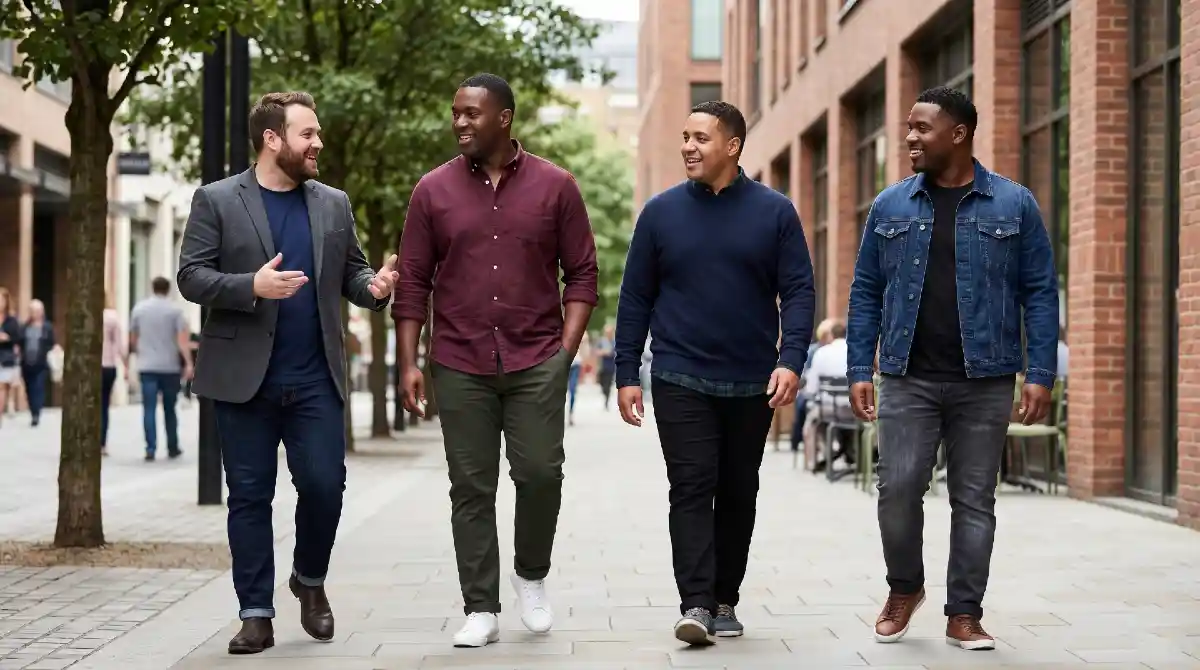
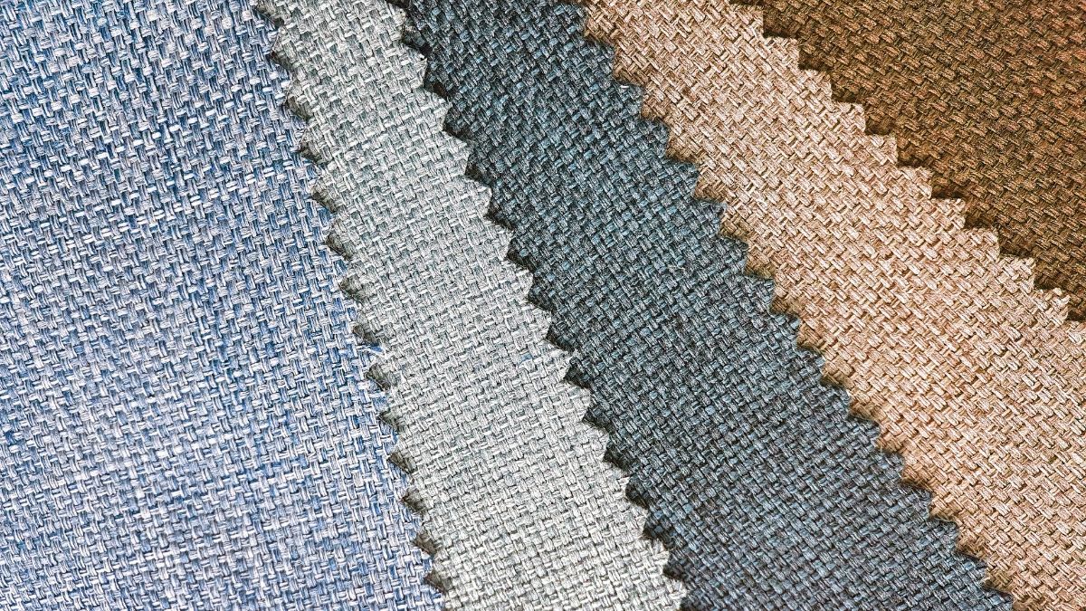
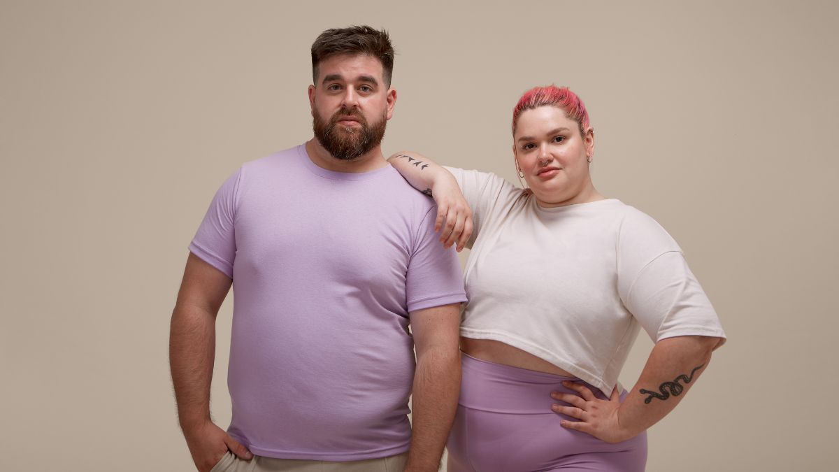
Good style has nothing to do with being skinny. Fit matters, sure, but color can completely change how clothes look on a bigger frame. Some shades sharpen your whole outfit and make getting dressed easier. Others pull attention to spots you’d rather not highlight or make clothes feel louder than they need to be.
Dark colors aren’t the only answer either. Plenty of bigger guys get stuck wearing black every day because they think it’s safest. That gets old fast. Rich earth tones, deep blues, muted greens, and even certain lighter colors can look clean, balanced, and confident without making you feel boxed in.
Small color choices can make jeans look better, shirts fit cleaner, and outfits feel more put together without trying too hard. A few shades work against you though, especially when the fit already isn’t perfect.
Navy, Charcoal, and Deep Burgundy Are Your Foundation Not Just Black
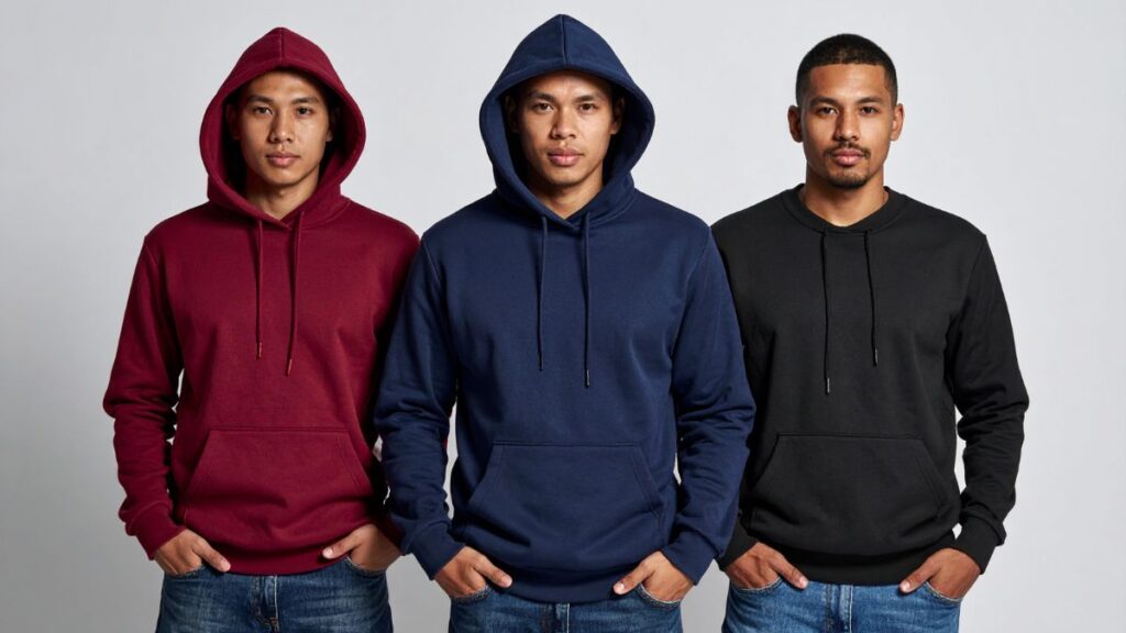
Black gets all the credit. Most plus size men build their entire wardrobe around it because someone once said it’s “slimming” and honestly, that advice isn’t wrong. But it’s incomplete.
What actually happens when you wear only black: you look put together, but you also look like you ran out of ideas. Navy, charcoal, and deep burgundy do the same slimming work as black and they make you look like you chose your outfit on purpose.
Navy works because it reads as dark from a distance but shows depth up close. That depth makes the eye move across your body instead of stopping at your widest point. Charcoal does the same thing with a warmer, softer edge than black it photographs better and doesn’t wash out most skin tones the way stark black can.
Deep burgundy is the one most men skip, and that’s a mistake. Rich, wine-toned colors pull the eye inward toward the center of the body. That creates a narrowing effect that flat, cool darks simply don’t.
Dark Olive, Forest Green, and Slate Blue Work Just as Hard as Black Without Repeating It
Most men treat “dark colors” and “black” like they mean the same thing. They don’t. Dark olive, forest green, and slate blue all sit in that same deep tonal range but they bring something black never can: personality.
Here’s why these three colors pull their weight for plus size men:
- Dark Olive absorbs light the same way black does, which means it doesn’t highlight the contours of your body. Worn as a jacket or chino, it creates a clean, unbroken silhouette from shoulder to hem.
- Forest Green works especially well for men with warm or medium skin tones because it creates contrast at the face drawing attention upward, away from the midsection. That vertical pull is exactly what you want.
- Slate Blue is a muted, grayed-down blue that sits darker than navy in certain lighting. Pairing a slate blue shirt with charcoal trousers creates a tonal look that elongates the body without matching too perfectly.
What these colors share is low saturation. They’re not bright. Not washed out. That middle zone is where plus size dressing wins deep enough to slim, interesting enough to stand out.
Monochromatic Tonal Dressing in Camel, Stone, and Rust Can Elongate More Than Dark Colors
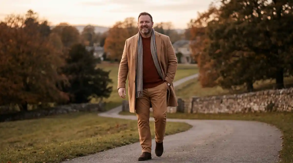
Dark colors slim. Everyone knows that. What most plus size men don’t know is that wearing one light-to-medium color head to toe can actually make you look taller and leaner than wearing dark colors with contrast breaks.
Science behind it. When your outfit has no visible color break no dark top with light trousers, no contrasting belt line the eye travels straight down your body without stopping. That uninterrupted vertical line is what creates the illusion of height and length.
Camel, stone, and rust are three neutrals that make this work in the real world:
- Camel worn top to bottom think camel coat over a camel or cream sweater creates one long warm column. No interruption. No horizontal cut across the body.
- Stone (a warm off-white or pale grey-beige) works the same way in warmer months. Linen trousers and a stone shirt in the same tonal family reads as intentional and elongating.
- Rust is deeper than the other two, which gives it more versatility across seasons. Pairing a rust overshirt with rust or tan chinos keeps the tonal flow intact without looking washed out.
Contrast dressing cuts your body in half visually. Tonal dressing stretches it. That’s the trade-off most men never think about — and it’s worth thinking about.
Dusty, Muted, and Earthy Tones Like Sage, Terracotta, and Warm Taupe Flatter Without Fighting Your Frame
Color feels risky when you’re plus size. Most men play it safe black, navy, grey because adding color feels like drawing attention to exactly what they don’t want attention on. That fear makes sense. But it’s based on the wrong version of color.
Bright, saturated colors add visual weight. Dusty, earthy, muted tones do not. That’s the distinction nobody talks about.
Here’s how each of these three works specifically:
- Sage is a greyed-down green that sits soft against most skin tones. Because it’s desaturated meaning the brightness has been dialed way back it doesn’t pop off the body the way lime or kelly green would. It adds color without expanding your silhouette.
- Terracotta pulls warm and earthy, which means it draws the eye toward your face rather than your midsection. Worn as a shirt or overshirt, it creates warmth and intention without fighting your frame.
- Warm Taupe sits between beige and grey with a slight brown undertone. Pairing it with darker trousers in the same warm family keeps the outfit cohesive while the taupe top stays soft and non-expanding.
The rule here is simple. Muted always beats bright. Earthy always beats neon. Low saturation is where plus size men can actually start having fun with color without second-guessing every choice.
Bright White Used Strategically as an Accent, Not a Base, Keeps You Looking Sharp

White gets avoided. Most plus size men hear “light colors expand” and immediately write off white entirely which means they miss out on one of the sharpest, cleanest tools in a well-built wardrobe.
White doesn’t have to be the problem. Where you put it is what matters.
Wearing a bright white t-shirt as your main layer makes your torso the widest, brightest thing in the outfit. That’s the version to avoid. But using white as an accent a controlled flash of contrast in a specific spot does the opposite. It draws the eye exactly where you want it.
Here’s how to use white without it working against you:
- White collar under a dark jacket or overshirt the contrast sits at your face and neck, pulling attention upward. Clean, sharp, intentional.
- White underlayer peeking at the hem or cuffs a small strip of white at the wrist or waist creates a deliberate layered look without expanding the widest part of your torso.
- White in accessories a white pocket square, white sneakers, or white cap pulls the eye to the edges of your silhouette, not the center.
Neon, Pastel, and High-Contrast Brights Are the Colors That Visually Add Size
Most plus size men already avoid these instinctively. Something just feels off about a neon yellow hoodie or a baby blue polo but without knowing exactly why, it’s hard to make confident choices. Here’s the actual reason these colors work against you.
Bright, saturated colors reflect more light. More light reflection means the eye is pulled toward that surface. When that surface is your torso or midsection, the result is that area looking larger than it actually is. That’s not opinion that’s how human vision processes contrast and brightness.
Here’s how each category creates that problem:
- Neons are the most aggressive offenders. Colors like lime green, hot pink, or electric orange are so high in saturation that they visually inflate any surface they cover. Wearing one across your chest is like putting a spotlight on your widest point.
- Pastels feel softer but carry the same problem. Baby blue, blush pink, and mint green are light in tone and light tones expand just like bright tones do. The effect is slightly gentler, but the direction is the same.
- High-contrast brights like royal blue, fire engine red, or sunshine yellow sit in the middle not quite neon, not pastel, but fully saturated. Worn as a main layer, they broadcast your silhouette rather than quieting it.
Busy Patterns and Light-on-Dark Color Blocking Break the Silhouette These Combos Do the Opposite
Picking the right individual colors is only half the battle. How you combine them is where most plus size men quietly go wrong not because they chose bad colors, but because the relationship between those colors is cutting their body in half.
Color blocking sounds stylish. And it can be. But a bright or light top paired with dark trousers creates a hard horizontal line right across your midsection and horizontal lines are exactly what you don’t want. That sharp contrast break is where the eye stops. Stopping is the opposite of elongating.
Here’s what breaks the silhouette versus what builds it:
- Light top, dark bottom the most common combination and the most damaging for plus size men. The contrast line sits at your waist, making that area the visual center of the outfit.
- Busy patterns across the chest bold checks, wide stripes, or large graphic prints spread visual noise across your widest point. The eye has nowhere to travel, so it just… stays there.
- What actually works: dark top, slightly lighter bottom in the same tonal family this keeps contrast low while still creating dimension. Think charcoal shirt with slate grey trousers, or navy jacket over dark indigo jeans.
- Vertical tonal shifts instead of horizontal blocks layering a long dark cardigan over a slightly lighter base creates vertical lines that pull the eye downward, not sideways.
Build Your Core Palette Around These 6 Colors and Stop Second Guessing Every Purchase
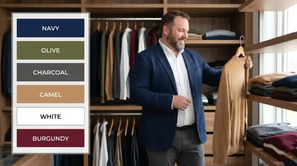
Most men leave an article like this feeling informed but still unsure in the store. That gap between knowing and deciding is where confidence breaks down. So here’s the shortcut six colors that work, why each one earns its place, and how to use them together.
Lock these in as your foundation:
- Navy your most versatile dark. Works as trousers, jackets, or shirts. Pairs with almost everything in this list without creating harsh contrast breaks.
- Charcoal the warmer, softer alternative to black. Photographs better, flatters more skin tones, and creates clean tonal pairings with navy or slate blue.
- Dark Olive your go-to when you want dark without repeating navy or charcoal. Brings depth and works across casual and smart-casual settings.
- Slate Blue the bridge color. Light enough to add variety, dark enough to stay slimming. Pairs tightly with charcoal for a tonal elongating combo.
- Warm Taupe your neutral for tonal dressing. Build a full head-to-toe look in this range and the vertical line does the work for you.
- Deep Burgundy your accent dark. Adds richness and pulls the eye inward when worn as a top layer over neutral trousers.
Every item you buy should connect to at least two colors on this list. That single rule eliminates impulse purchases that don’t work with anything, and builds a wardrobe where everything pairs without thinking.
Hello there! I’m Jesse Joe, the author and editor behind SolganGenius. I’m thrilled you’ve stopped by, and I can’t wait to share with you the essence of what this platform is all about.
I’m a writer, social media enthusiast, and a firm believer in the power of words. I’ve always been fascinated by how a simple phrase or slogan can capture an emotion, convey a message, and even change perspectives. Learn More