
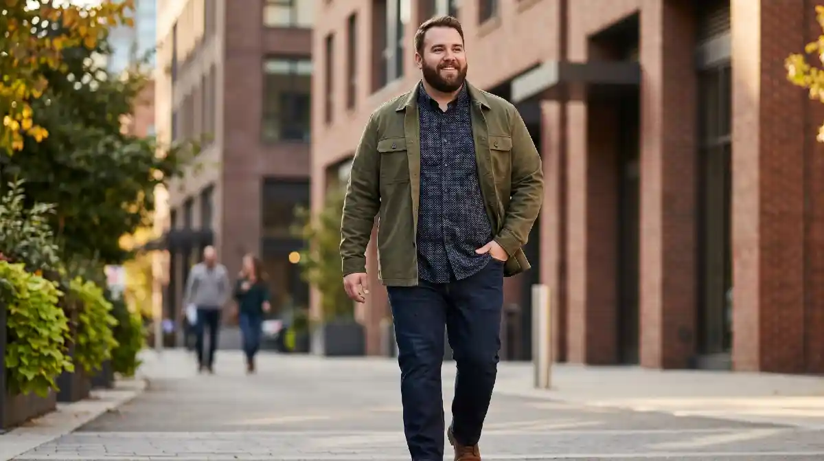
Solid colours became your default for a reason. Someone, somewhere, told you patterns weren’t for bigger guys and after one or two bad experiences, you stopped questioning it. That advice wasn’t completely wrong. Some patterns genuinely do add visual bulk. But the blanket rule that all patterns are off-limits? That’s what’s been keeping your wardrobe stuck.
Patterns aren’t the problem. Scale, contrast, and direction are. Once you understand those three things, you can look at any shirt, jacket, or trouser and know immediately whether it works for your frame no guessing, no second-guessing yourself in the fitting room.
This article breaks it all down plainly. What works and exactly why. What doesn’t and exactly why. By the end, you’ll have a clear filter you can use every time you shop starting with the most important thing most men get wrong.
You Probably Gave Up on Patterns Based on Bad Advice
Somewhere along the way, someone told you to stick to solid colours. Maybe it was a magazine, a well-meaning friend, or just years of quietly noticing that patterned shirts felt like too much. So you played it safe. Dark solids. Plain everything. And it worked kind of but you’ve been dressing around your body instead of for it.
What that advice got wrong:
- It treated “patterns” as one thing. A tiny micro-print and a massive bold plaid are both patterns but they do completely opposite things on a larger frame. Avoiding all patterns because of some is like avoiding all food because of one bad meal.
- It gave you a rule with no reason behind it. When you don’t know why something works or doesn’t, you can’t make your own calls. You just follow the rule forever and stay stuck.
The truth is simpler than you’ve been told. Some patterns genuinely do add visual bulk. Others actually help your proportions.
Knowing the difference isn’t a style secret it’s just understanding how the eye moves across fabric. That’s what this article gives you. Not a list of rules to memorise, but the logic behind them so you can walk into any store and figure it out yourself.
The Real Reason Some Patterns Make You Look Bigger (It’s Not What You Think)
Most men think certain patterns are just “bad for big guys.” Stripes get blamed. Checks get avoided. Florals get written off completely. But the pattern type isn’t actually the problem it’s three specific things that determine whether any pattern works on a larger frame or fights against it.
What actually controls how a pattern reads on your body:
- Scale A pattern that’s too large relative to your body creates visual noise with no clear end point. Your eye doesn’t know where to stop, so it reads the whole surface as one big shape. Smaller, tighter repeats give the eye something to anchor to without expanding what it sees.
- Contrast High contrast between colours in a pattern think bright white and bold black creates hard edges that highlight width. Lower contrast patterns, where the colours sit close together in tone, read as quieter and don’t draw the same attention to size.
Now add direction into the mix:
- Direction Horizontal lines pull the eye side to side, which adds the appearance of width. Vertical lines pull the eye up and down, which creates the illusion of height and a leaner silhouette.
That’s the whole framework. Scale, contrast, direction. Every pattern you’ll ever look at can be judged by these three things. Once you understand them, you stop guessing and start choosing with confidence.
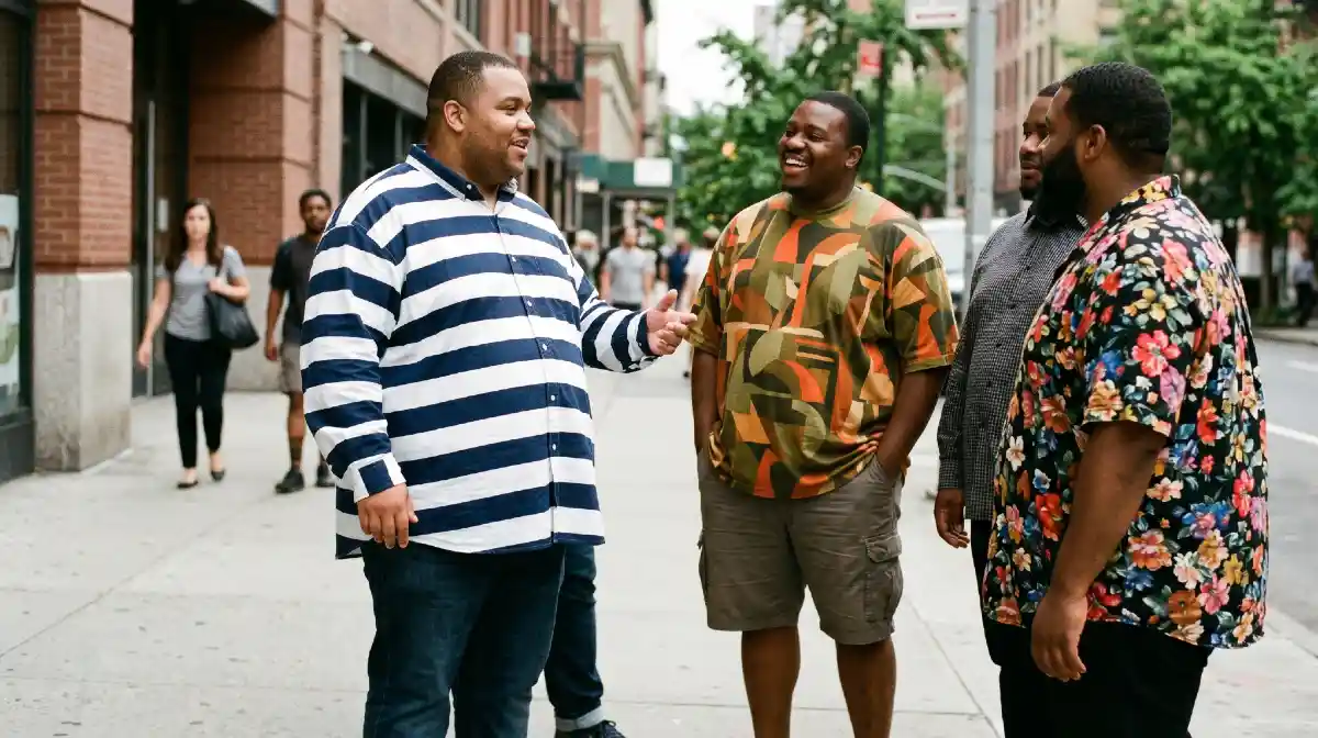
The Patterns That Actually Work in Your Favour
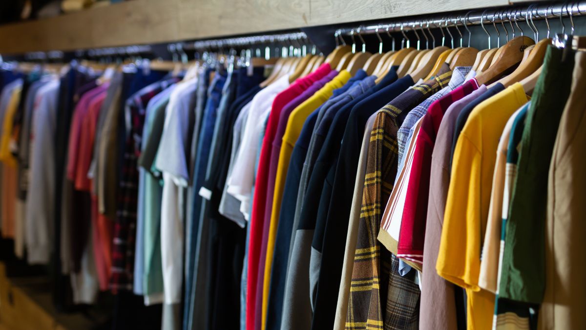
Armed with the scale, contrast, and direction framework, picking the right patterns becomes straightforward. These aren’t random recommendations each one works because of something specific about how it behaves on a larger frame.
Patterns that consistently work well:
- Micro-prints Small, tight repeats like fine ditsy prints or mini polka dots keep the eye moving in a contained area. Nothing jumps out, nothing expands. Your body reads as one clean shape instead of a series of loud visual blocks.
- Tonal patterns These use two colours that sit close together in tone, like navy on dark blue or olive on khaki. Low contrast means no hard edges. The pattern adds texture and visual interest without drawing attention to width.
- Vertical-dominant prints Thin vertical stripes, elongated geometrics, and narrow pin-checks all pull the eye upward. That vertical movement creates the appearance of height, which naturally makes the silhouette read leaner without doing anything else.
Now, the pattern that surprises most men:
- Medium-scale geometrics Patterns like a modest houndstooth or a restrained windowpane check work well when the repeat is no larger than a playing card. Bigger than that and they start adding visual bulk. Keep them compact and they add structure without expanding your frame.
Every one of these works by keeping contrast low, scale tight, or direction vertical sometimes all three at once. That’s not a coincidence. That’s the framework doing its job.
The Patterns That Will Make You Look Larger And Why They Do It

Nobody talks about this part honestly. Most style guides just say “avoid bold patterns” and move on, leaving you with a rule but no understanding. Knowing why these patterns add visual bulk means you’ll spot the problem yourself in any store, on any shirt without needing a checklist.
Here are the patterns that consistently work against a larger frame:
- Wide horizontal stripes Thick bands of colour pull the eye directly sideways across the widest part of your body. A narrow 1cm stripe behaves differently than a 5cm one. The wider the band, the more it emphasises breadth rather than height.
- Oversized checks and large plaids When a check repeat is larger than a playing card, it breaks your torso into big visible blocks. Each block reads as its own shape, and together they make the overall silhouette feel wider and heavier than it is.
Now the one that catches most men off guard:
- High-contrast bold prints A large floral or graphic print in stark contrasting colours bright red on white, bold black on cream creates hard visual edges all over the fabric. Those edges highlight every point where your body is widest, making size the first thing the eye registers.
That shirt that felt “too much” when you tried it on? This is almost certainly why. The pattern wasn’t wrong because it was a pattern it was wrong because of its scale, its contrast, or both working against you at the same time.
Where You Wear a Pattern Matters as Much as Which Pattern You Choose
Most men pick a pattern and stop there. They find something that follows the rules small scale, low contrast, vertical direction and assume the work is done. But the same pattern placed in different spots on your body produces completely different results. Placement is the part of this conversation that almost nobody talks about.
Here’s how placement changes everything:
- Chest and torso patterns draw the eye inward and outward A bold pattern across the full chest immediately becomes the focal point. Your eye goes straight to the widest part of the frame. A pattern that’s contained to one side — a small chest pocket print, an offset motif — creates interest without broadcasting width.
- Sleeve and shoulder patterns add bulk at the top Print fabric that runs across the shoulder seam and down the sleeve makes shoulders read as wider. Keep patterns away from the shoulder line if width at the top is something you want to avoid.
Now the placement move that actually works in your favour:
- Patterns at the hem or lower half pull the eye downward A subtle print on the lower portion of a shirt or on trousers draws attention away from the midsection entirely. That downward pull creates a longer, leaner visual line from top to bottom.
Think of it this way. Pattern is what you wear. Placement is where the eye goes. Getting both right is what makes an outfit look intentional instead of accidental and that’s the difference between a man who follows style rules and one who actually understands them.
How to Mix a Pattern Without It Wearing You
Where most men go wrong after learning which patterns work. They find a good micro-print shirt, feel confident, and then pair it with patterned trousers because both pieces individually follow the rules. Suddenly the outfit feels chaotic. Two “safe” patterns together can still create visual noise that pulls the eye in too many directions at once.
How to build an outfit around a pattern without losing control of it:
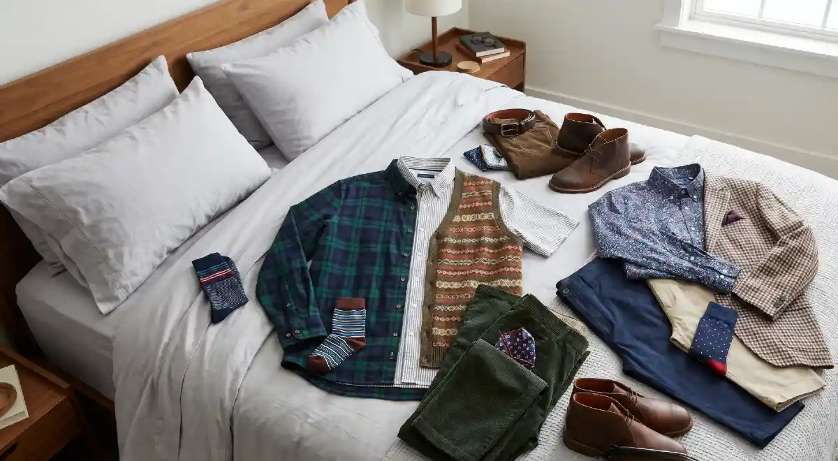
- One pattern per outfit, anchored by solids Let one piece carry the pattern and let everything else stay plain. A micro-print shirt works best with flat-colour chinos in a neutral tone — navy, stone, or olive. The solid bottom gives the eye somewhere to rest and stops the pattern from taking over the whole look.
- Match the tone of your solid to the quieter colour in your pattern If your shirt has a navy and white micro-print, wear navy trousers rather than white or a third colour entirely. Pulling one colour from the pattern into the solid creates a connected, intentional look rather than two pieces competing.
Now the rule that ties it all together:
- Busy pattern up top always needs a clean, dark bottom Dark trousers with no texture or print visually anchor the lower half of your body. That grounding effect stops the pattern from making your silhouette feel top-heavy or unbalanced.
One pattern. One anchor. One colour connection. That’s the whole formula and it works every single time.
The Simple Test You Can Run Before Buying Any Patterned Piece
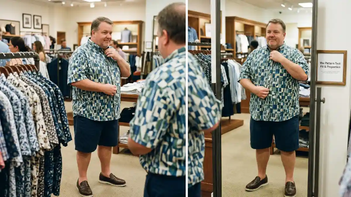
Most men judge a patterned piece by how it looks on the hanger or on a model. Neither tells you anything useful. A pattern that looks sharp folded on a shelf can completely change once it’s stretched across a real body. What you need is a fast, repeatable check you can run in under sixty seconds in a fitting room or even from a product photo online.
Before buying, run through these three questions in order:
- Is the repeat smaller than a playing card? Hold your hand flat against the pattern. If the repeat of the check, stripe, or print is larger than your palm, the scale is working against you. Put it back. If it fits within your palm or smaller, move to the next check.
- Are the two main colours close in tone? Squint at the pattern slightly. If the contrast between colours almost disappears when you squint, the pattern is tonal enough to work. If the colours still jump out sharply at each other, the contrast is too high.
Now the final check the one that closes the decision:
- Does the pattern have a clear vertical movement or no dominant direction? Step back and look at it from arm’s length. Patterns that pull your eye upward or move in no strong direction at all are safe. Anything that pulls your eye sideways fails the test.
Three questions. Thirty seconds. Pass all three and buy with confidence. Fail any one and walk away because no amount of styling fixes a pattern that’s working against your frame from the start.
Hello there! I’m Jesse Joe, the author and editor behind SolganGenius. I’m thrilled you’ve stopped by, and I can’t wait to share with you the essence of what this platform is all about.
I’m a writer, social media enthusiast, and a firm believer in the power of words. I’ve always been fascinated by how a simple phrase or slogan can capture an emotion, convey a message, and even change perspectives. Learn More